The Tools competency of the Community Maturity Model™ considers the technical architecture of an organization, and how social technologies and community tools fit into it. Tools can be anything that provides efficiencies or leverage and require investment (both for the tool itself and for the training) behavior change, and changes to the environment needed to use the tool effectively. You can learn more about how we think about community tools in our Community Technology Framework™.
Communities are not a “set it and forget it” proposition. Increasingly, community teams are making design and user interface/experience changes on a quarterly or annual basis. Even if it’s simply adding a new module or updating the icons on your home page, making changes helps drive interest and engagement. You don’t need a background in UX to make meaningful improvements to the design of your community.
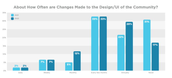
While we saw a jump in the number of respondents in our 2022 State of Community Management research making monthly changes to their community, and frankly, this seems like overkill. While you should definitely be adding, updating, and removing stale content from your community (especially on your home page or landing page where people typically begin their journey) changing the core design elements too frequently can be confusing and disorienting to users.
However, if you’re one of the people who is never making changes (17% in 2022 vs 31% in 2021), you should consider making modest improvements on an annual basis at a minimum. The internet moves fast, and you don’t want users to feel like your site is outdated. Keep reading for expert UX advice for your community program.

Expert UX Advice for Your Community
Stephanie Field is a Community Manager at Carbon Black. She shared her best practices for designing a thoughtful community ux to increase engagement and user satisfaction.
Being able to easily navigate a community is key for customers, partners, stakeholders, and employees. Giving them easy access to the information they are looking for, and intuitive ways to participate is critical to community adoption, and long-term community health.
Do leverage internal experts.
Mine your organization for internal resources that are experts in user experience for feedback and ideas. This might include your UX team, designers and QA folks.
Do your research.
Conducting research beforehand ensures that you have the interests of your audience in mind. Analytics, stakeholder interviews and end-user interviews all contribute to a well-rounded view of needs.
Don’t procrastinate.
When you have to rely on other teams to be successful be proactive with the project deliverables. Getting the necessary resources in place so everything is ready for go-live will make sure you launch smoothly.
Don’t over-promise.
Set clear expectations in the beginning of the project of what internal stakeholders and end users can expect. When you crush expectations, then everyone will be even more bought into the UX.
Get more community ideas and advice in the 13th annual 2022 State of Community Management report:

